A guide to start a design system
A guide to start a design system
Design systems are more important than ever, especially in this hyper-competitive market. Designers are willing to deliver quality work in a fast manner. More designers in the company mean new ideas in typography, color palettes, and new patterns appear in projects. And the only way to solve this is to have a scalable design system that helps to control the chaos and decrease inconsistency and make the work more efficient.
In this guide, I will share with you what I have learned while working on the Obytes design system On how to create styles and components for a design system. It takes at least one committed person to kick off the process and change the way your organization builds software.
Here's a checklist of what I'm going to talk about:
- Patterns
- Colors
- Typography
- Spacing
- Icons
- Buttons
- Forms
Patterns
One of the great places to start is by taking a look at what you already have out there. If your company already has a working product that is already out on the market, you need to know how it is created, and what things exist there. So you start building an inventory of all the different patterns, colors, text styles, and assets used in the product. Start by going through everything that you have and start taking screenshots, after gathering everything start labeling them by categories. Once you've finished you will notice what pieces will need some consistency or what things we don't even want in our assets.
Colors
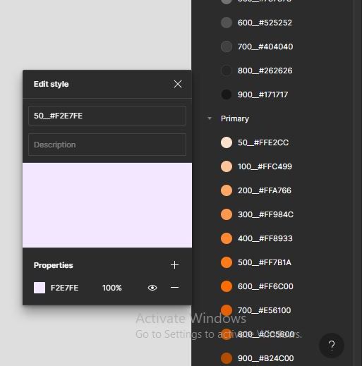
After you've created your inventory you can start creating color styles based on what you have, collect and start organizing them by a common denominator, hue, shades, tones, or by similarity (Primary, Grays, Success, Warnings, Destructive…) and start naming them by their hex color code and a number (100 to 900 on a scale that indicates lighter or darker colors of the base color) to let the user know the amount of contrast, for example, Gray100#333333. After creating your color palette you can test it to ensure that it will serve your team well. Just make sure your color palette has a good contrast ratio and that it complies with WCAG guidelines.
Typography
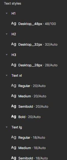
Lack of a typography design system can easily cause inconsistency that might confuse the user, the way to create typography styles is a bit similar to colors, choose the approved typefaces Browse the design and walkthrough the text styles used, and create a consistent scale for typography based on the device used to fix the existing and future inconsistencies. When building the scale, don’t forget that you’re not only setting the size of the font, but also the weight, line height, and other properties.
Spacing
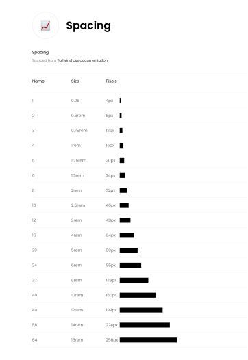
Spacing is one of the most important elements to make a design look well put together and give it a consistent experience in the eyes of the user, the most commonly used style property in almost any design is whitespace. Whether we’re spacing apart links in a header, spacing apart items in a grid, adding some distance between an avatar and a link, or padding out a dropdown component, no whitespace in our product should be arbitrary or unintentional. It's best to use a spatial scale of an 8 point grid. If your development team is already using a framework it's best to stick with the spacing scale that is used on it.
Icons
Icons are a very important part of the visual language and should become part of the system, make sure that the icon pack you choose can be implemented in the frontend, and has different variations ( light, regular, bold, duotone, fill) to make it accessible in your design system file as components to be used in other components like buttons for example. If you’re changing the technology used to implement icons, implement icons on a test server and thoroughly test, A good icon pack that I can suggest is phosphor icons.
Buttons
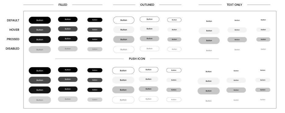
Create button components based on the buttons that you already have on the product, and include the button states (default, hover, focused, disabled, error) to let the design system users know what it would look like, and don’t forget to include the different button sizes, different types of buttons (Primary, Secondary, Tertiary).
Forms
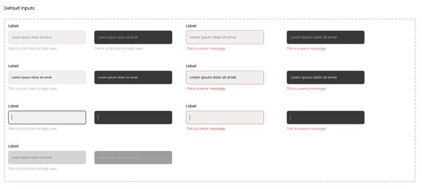
Forms are quite similar to buttons just make sure to include different types of forms for example (Default, Dropdown, Password, Date, Credit card, Tags, Search Inputs...) with their states.
Once you've finished your building blocks of the system and it was tested and verified by the designers and developers, start working on patterns and know that this process doesn't end, products are always evolving and so is your design system, and gradually correct all the inconsistencies.