


Introduction
In today's digital landscape, UI design is essential for creating successful digital products. Effective organization and presentation of data within the interface can make or break the user experience. Join me as we explore the significance of information architecture in UI design, providing actionable guidelines and best practices to optimize user experiences.
Taking inspiration from the Apple TV+ series 'Ted Lasso', which follows the story of an American college football coach from Kansas who unexpectedly finds himself leading a professional soccer team in England, despite having no previous experience in the sport. Similar to Ted's unorthodox coaching methods, which ultimately proved highly effective despite initial doubts, this article aims to incorporate captivating imagery from the series. Each scene represents a specific aspect of UI design, envisioning the soccer field as a web or mobile page. Just like the players on the field, various best practices will be discussed, working together to enhance the overall UI structure and data presentation.
1.The Significance of Information Architecture in UI Design

Information architecture in UI design refers to the organization, structure, and hierarchy of data within an interface. It involves carefully arranging and categorizing information to create meaningful relationships and enable users to navigate and comprehend the content effortlessly. By strategically planning data architecture, UI designers can streamline user interactions, simplify complex information, and guide users toward their goals.
Furthermore, the integration of AI into UI design aims to create a cohesive user experience by ensuring consistent design patterns and visual elements throughout the interface. In "Ted Lasso," the character of Ted acts as the architect of team dynamics, fostering a sense of unity and collaboration among the players. He creates a cohesive team structure, establishes clear roles, and encourages open communication, just as IA establishes consistency and coherence in UI design.
2. The Role and Impact of Data Architecture in UI Design

Well-designed data architecture plays a crucial role in streamlining user flow, minimizing cognitive load, and maximizing engagement. It presents information in a logical and intuitive manner, guiding users effortlessly through the interface. Effective data architecture enhances findability through intuitive navigation patterns, categorization, and search functionalities, resulting in quick access to the needed information and improved user satisfaction.
Clear and concise data presentation is essential for promoting information comprehension. Proper information hierarchy, visual cues, and data visualization techniques enable users to understand content at a glance, facilitating usability and informed decision-making.
By decomposing complex information into smaller, meaningful fragments, AI integration in UI design simplifies complexity. Similarly, Ted Lasso simplifies the complexities of soccer for his team, focusing on fundamental aspects and emphasizing teamwork, motivation, and resilience. Both information architecture and Ted Lasso's approach help users/players navigate and comprehend information or the game more effectively by breaking it down into manageable units.
3. Best Practices for Effective Data Presentation in UI
To effectively present data in a user interface (UI), it is essential to adhere to best practices that promote clarity, comprehension, and visual appeal. Here are some recommended approaches for achieving effective data presentation in UI:
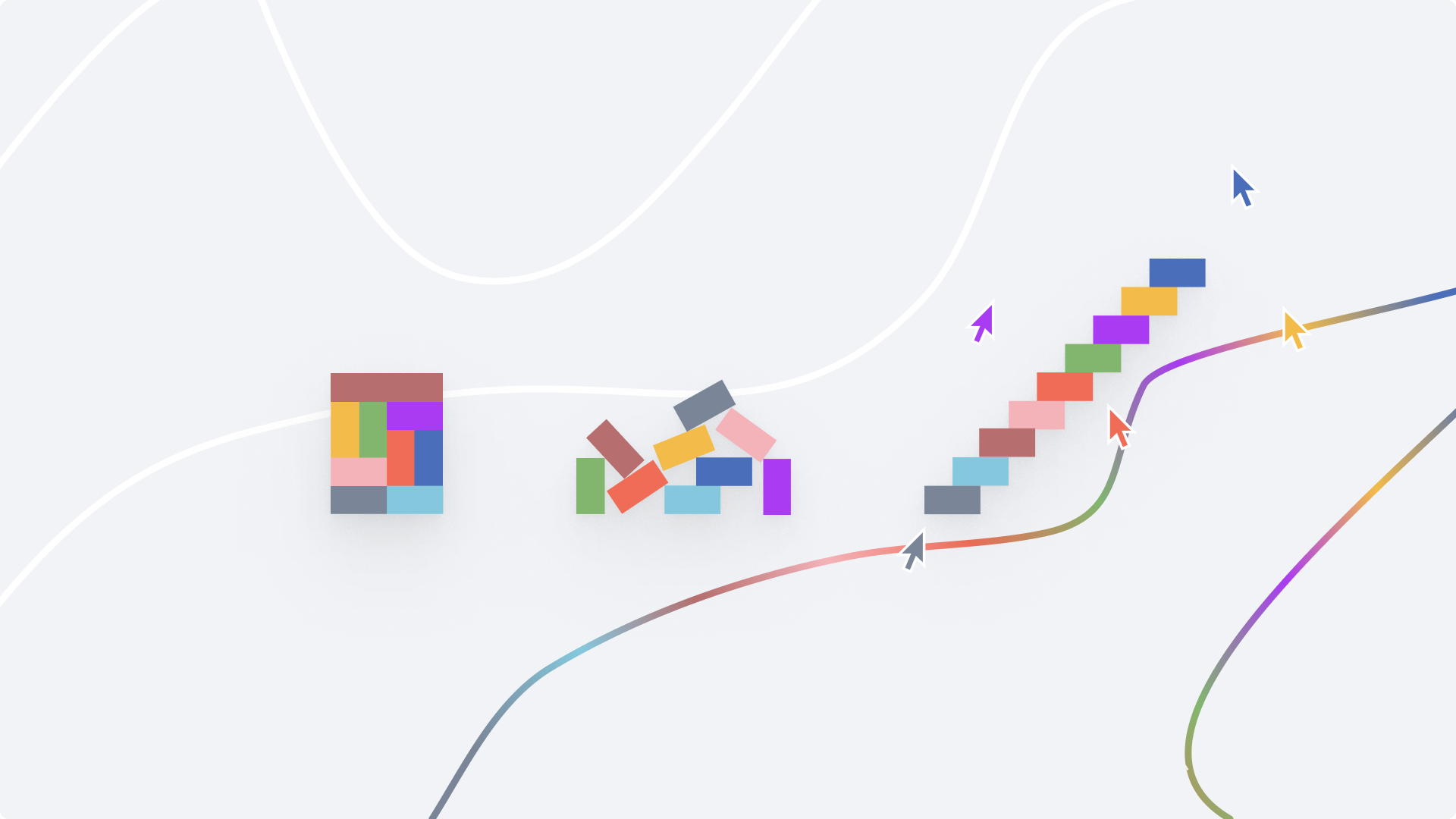
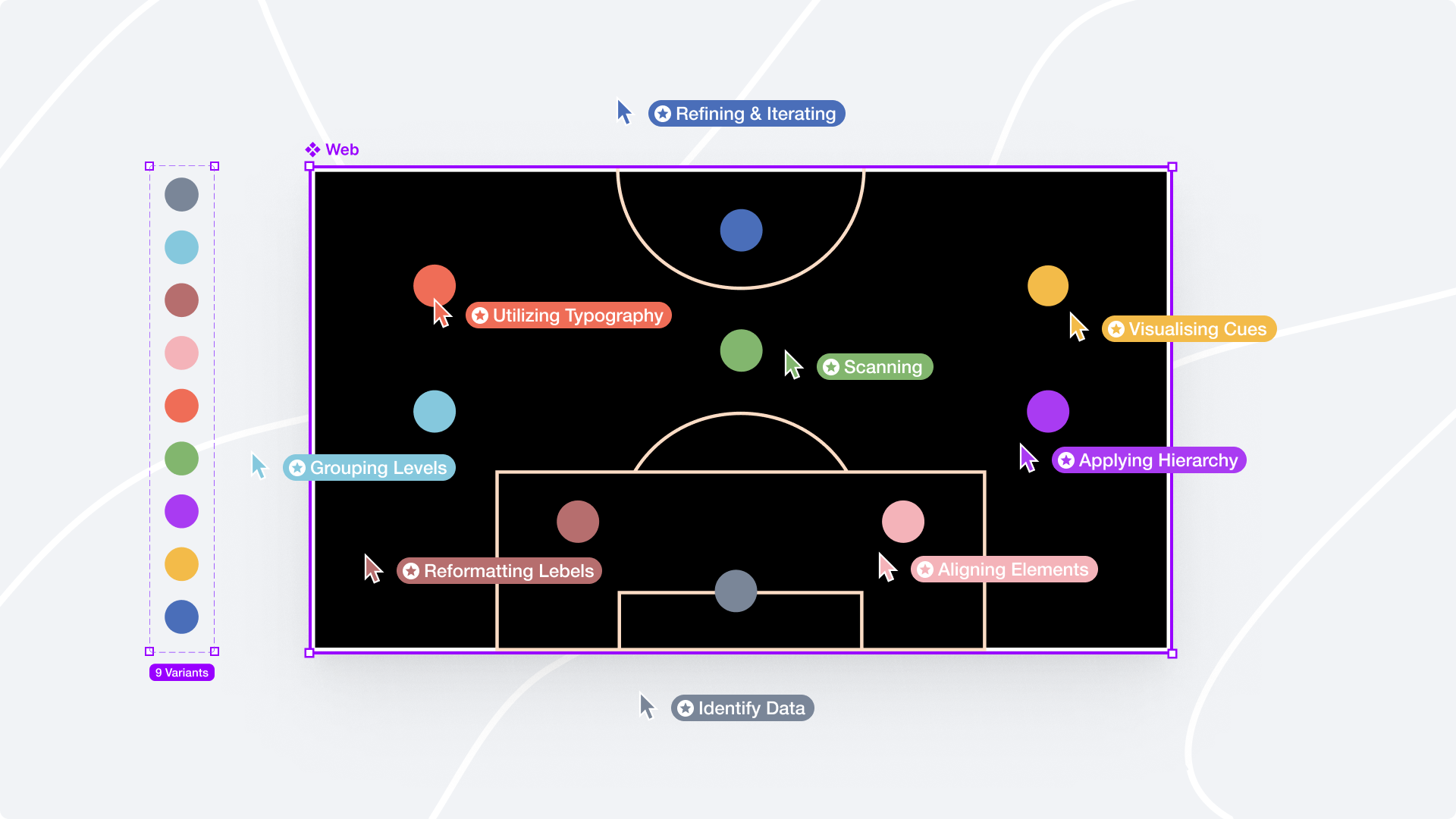
- Identifying the Most Important Data
- Grouping Data Levels and Containers
- Reformatting to Clear and Concise Label
- Align elements consistently
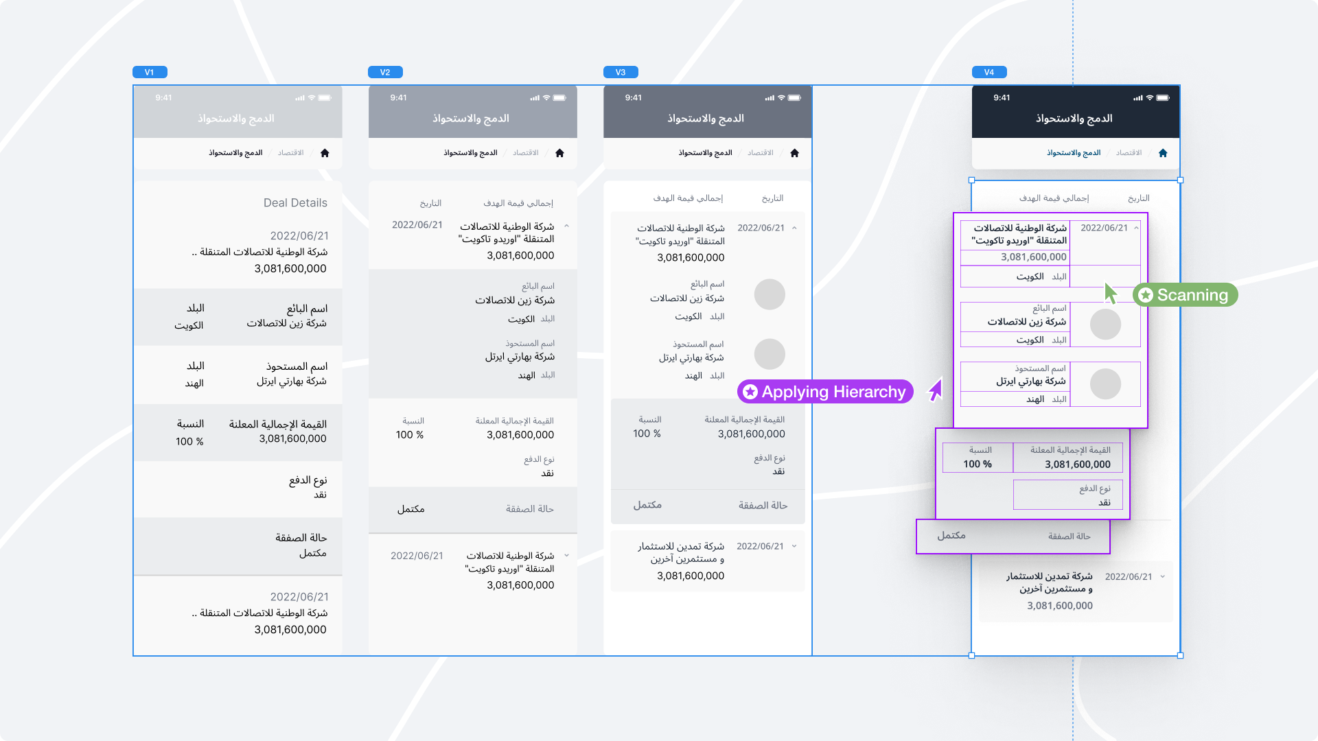
- Applying Visual Hierarchy
- Design for scanning
- Use appropriate typography
- Using Visual Cues
- Refine and Iterate
By adhering to these guidelines, you can optimize data presentation and develop intuitive, engaging, and user-friendly interfaces. While the connection between information architecture and "Ted Lasso" is more metaphorical than literal, it highlights the broader concepts of organizing information, creating cohesive systems, and simplifying complexity, which is relevant to both UI design and the show's narrative.
4. How can Data sheets be transformed into User-friendly UI screens?
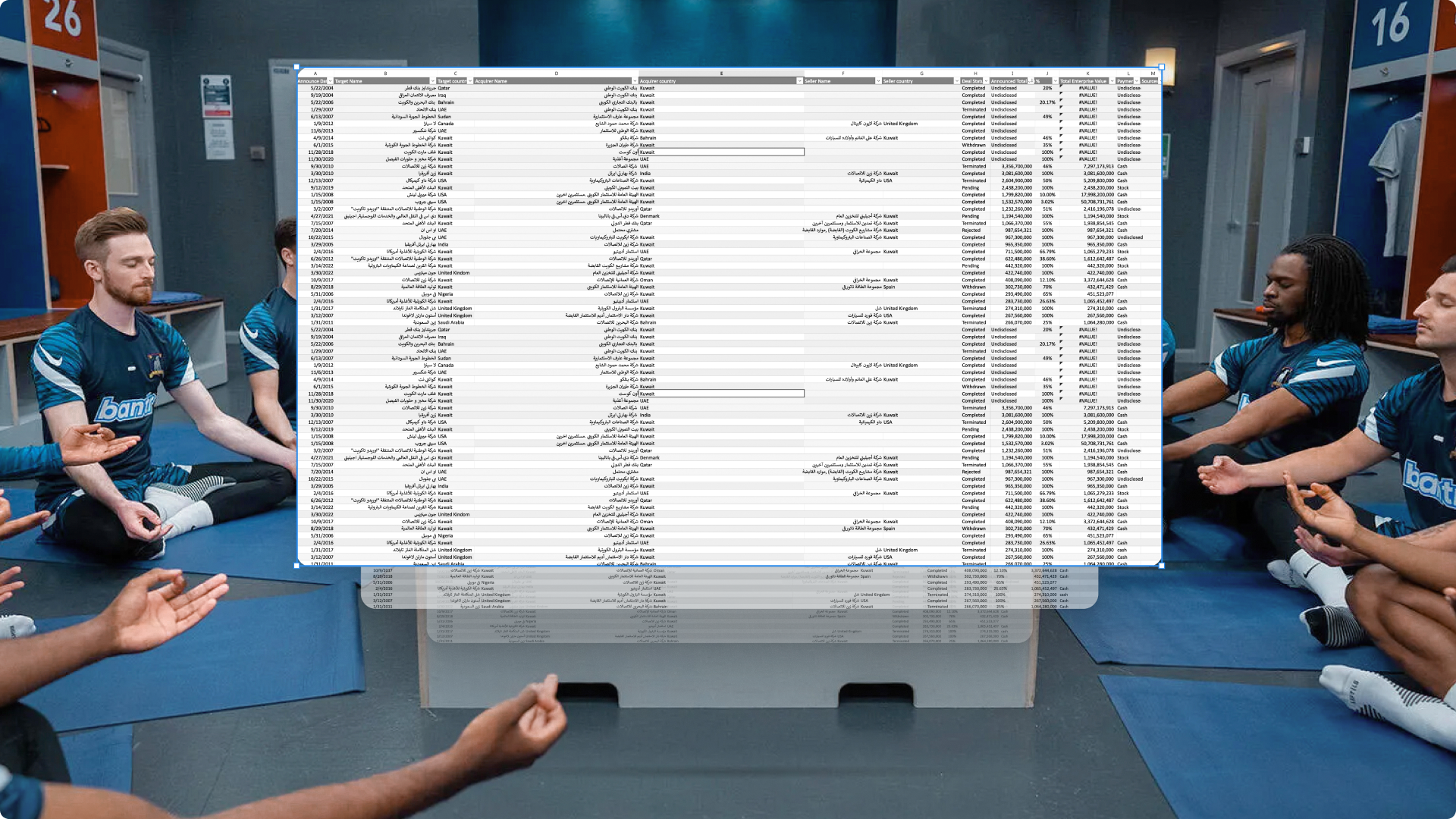
As a UI designer, I was assigned the task of organizing a data table containing mergers and acquisitions deals from the Gulf countries. The table consisted of 78 rows and 8 columns, including information such as the announcement date, company names, total enterprise value, countries of the involved parties, announced total, payment type, and status.
When it comes to displaying a table of this size on a desktop, there are no difficulties because there is plenty of screen space available. Users can easily scan both horizontally and vertically and utilize filtering and sorting functions. However, the situation changes when considering mobile devices, as the screen space is limited and users tend to have shorter attention spans.
This leads us to consider how users can effectively consume this information.
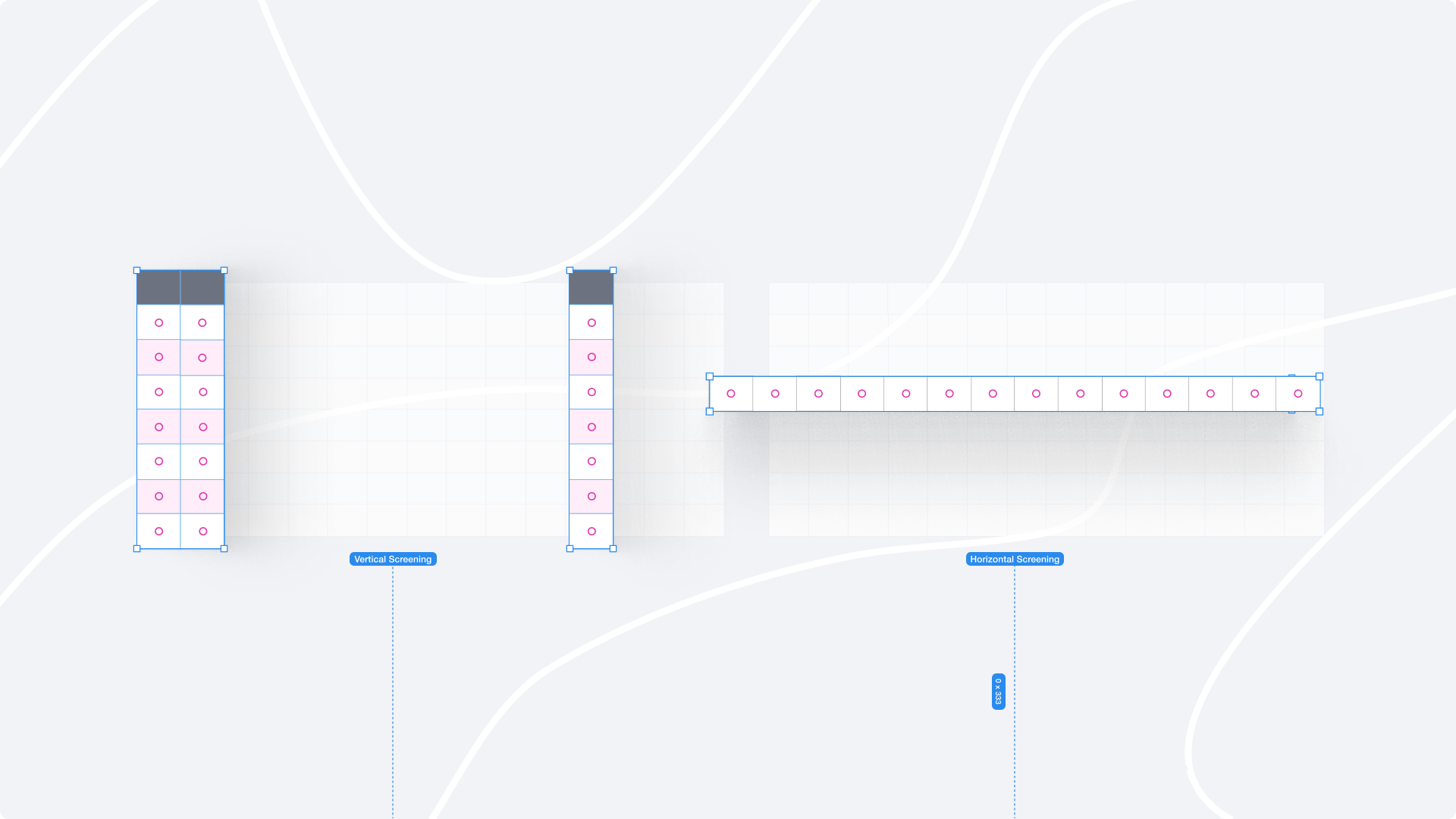
Users interact with the information by examining and interpreting the data presented in the table. They may analyze the rows and columns to locate specific data points or patterns. To narrow down the information based on their specific requirements, users often rely on filtering and sorting options. They may also compare and contrast different values or elements within the table to extract valuable insights. Additionally, users can make use of additional tools such as data visualization or exporting features to facilitate further analysis. Ultimately, the approach to consuming the information varies depending on the objectives and needs of the users.

Part I: The Data Organization
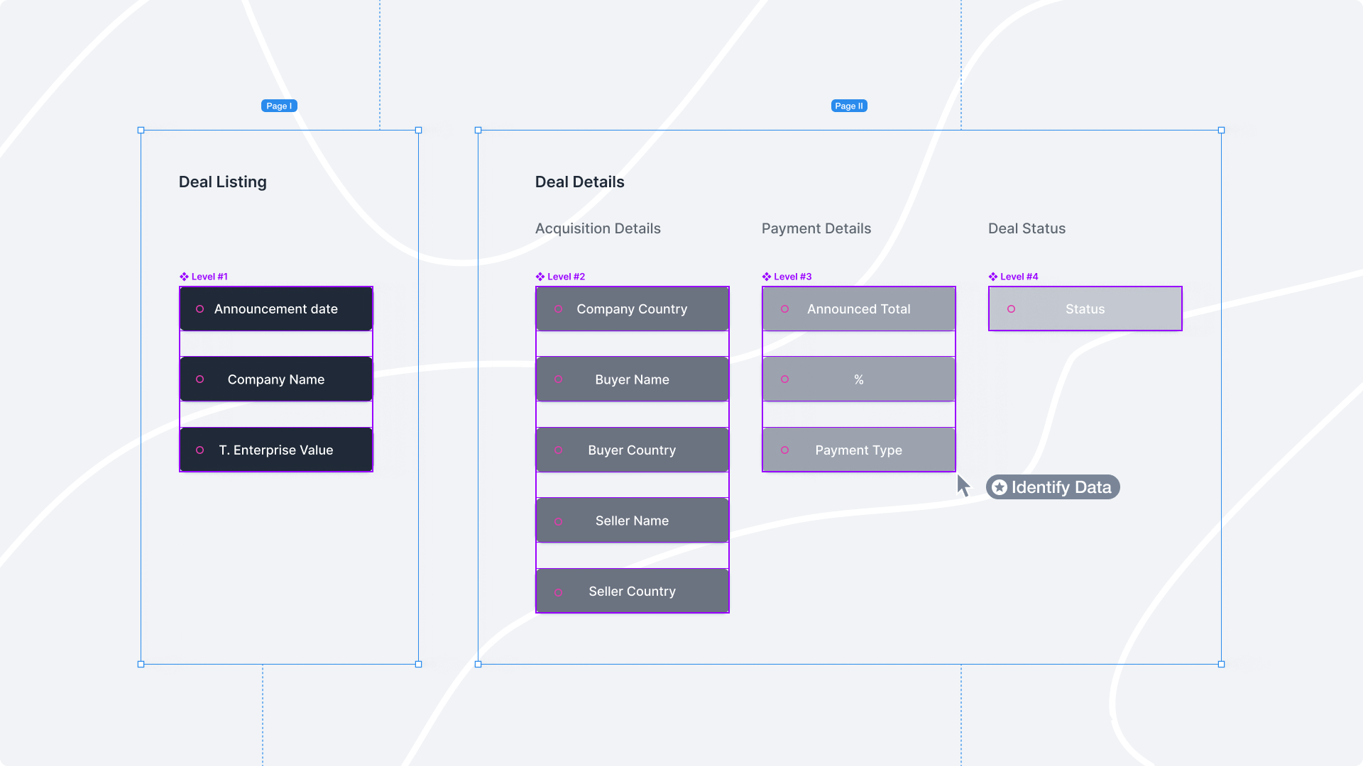
Identifying the Most Important Data: When dealing with Excel sheets, especially ones with a large amount of data, it's important to prioritize the information that is most relevant and valuable to the users to be featured prominently on the page.
Grouping Data Levels and Containers: Organizing related data elements into logical groups, hierarchies, or containers helps users make sense of the information. This practice improves navigation and ensures that users can easily find the data they are looking for.
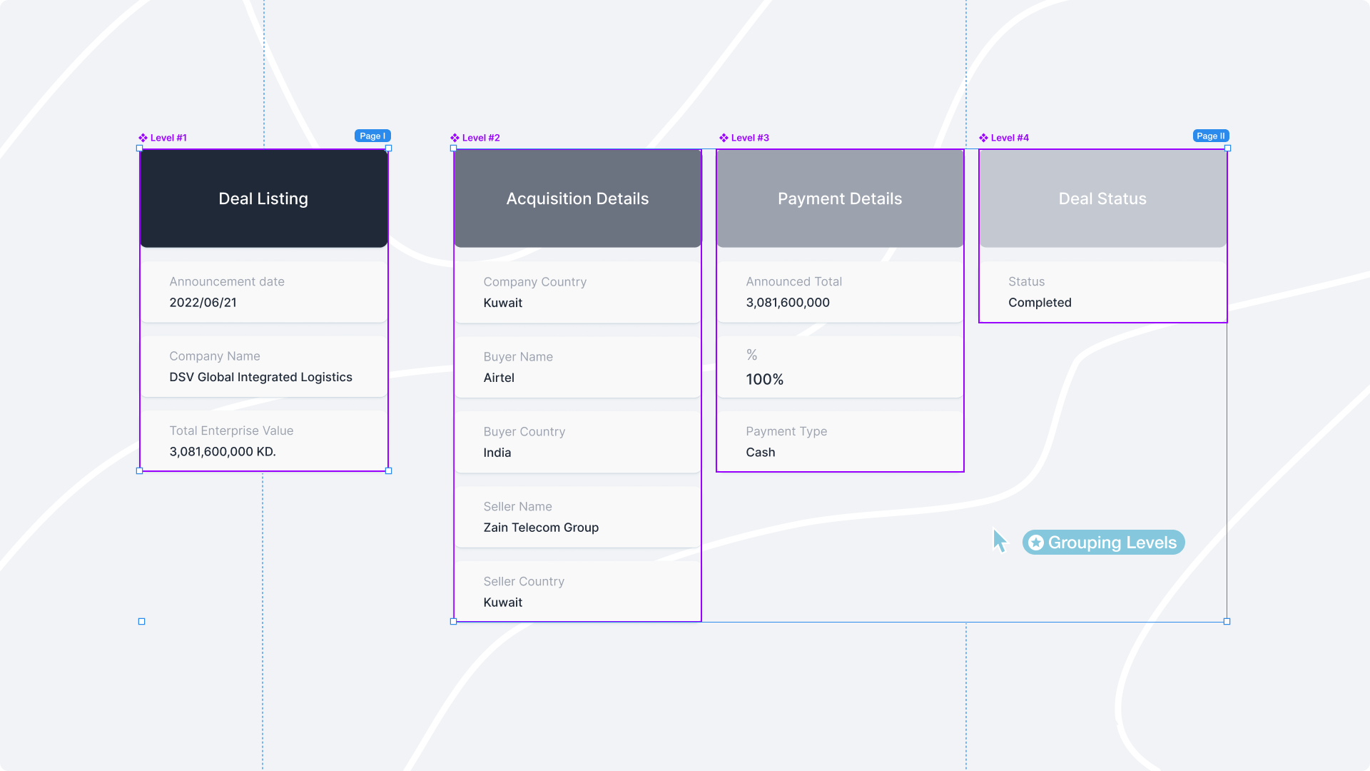
Reformatting to Clear and Concise Label: Labels should accurately describe the data they represent. Avoiding vague or ambiguous labels that might confuse users. For example, instead of using a generic label like "Company/Buyer Name," opt for more specific labels such as "Acquirer/Target Name". Also, choosing labels that are familiar to the target audience or industry.
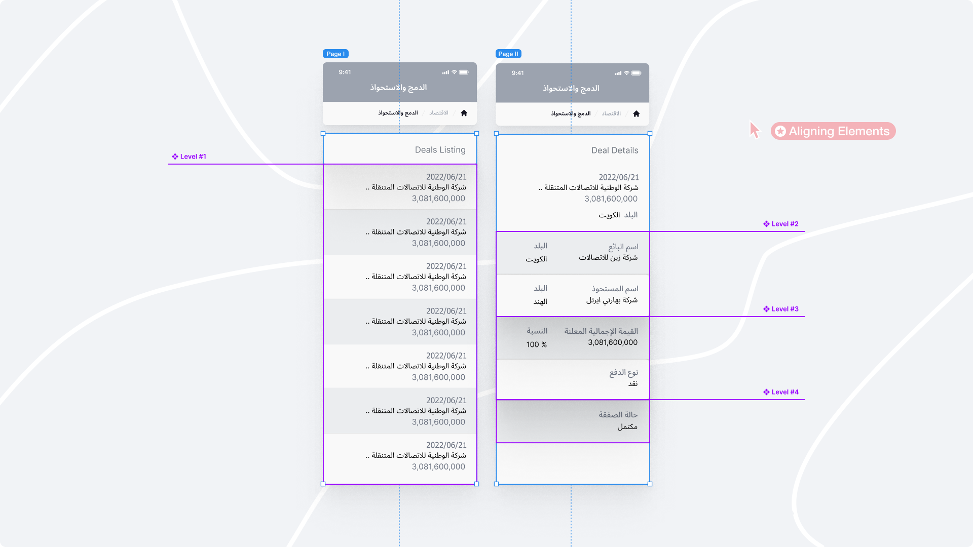
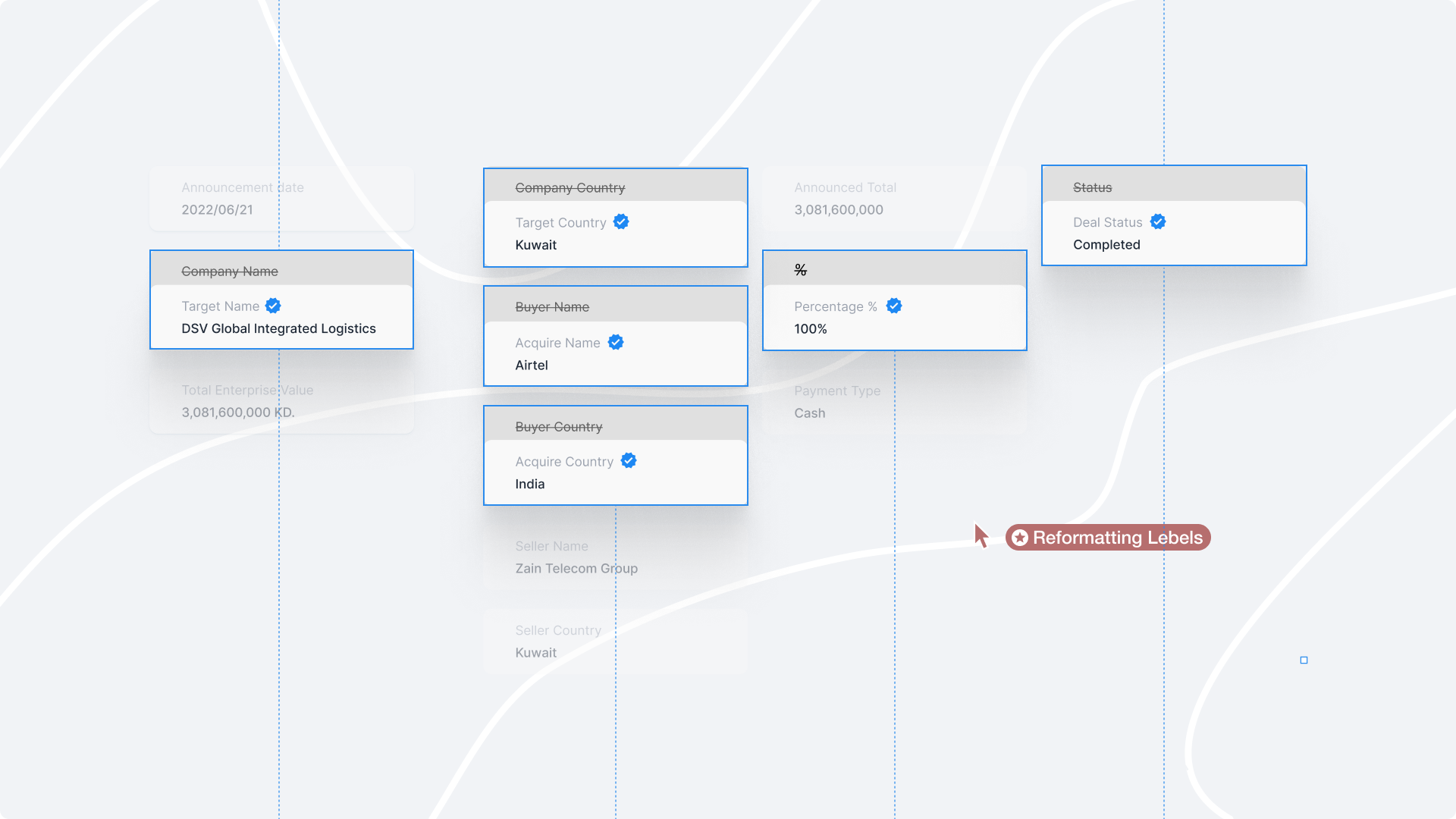
Align elements consistently: Consistent alignment aids in creating an organized visual hierarchy. Align similar data elements, labels, or headings to a common grid or baseline. This alignment provides a sense of order and cohesion, making it easier for users to process and compare information.
Part II: The Visual Presentation
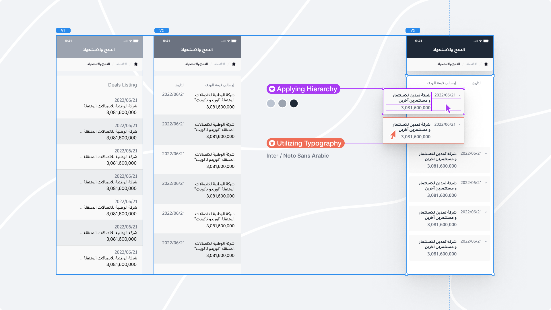
Applying Visual Hierarchy: Visual hierarchy establishes the relative importance and relationships between different data elements. Utilize font size, color, and spacing to create a clear visual structure that guides users through the interface.
Use appropriate typography: Typography plays a significant role in establishing visual hierarchy. Utilize font styles, sizes, and weights to differentiate between different levels of information. Headings and subheadings should stand out from the body text, aiding users in scanning and understanding the content hierarchy.
Design for scanning: Make sure the page is easy to scan and that users can quickly find the information they need.
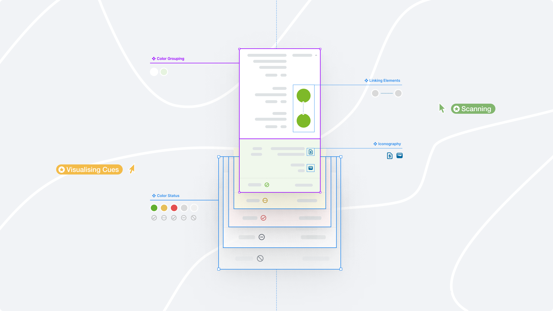
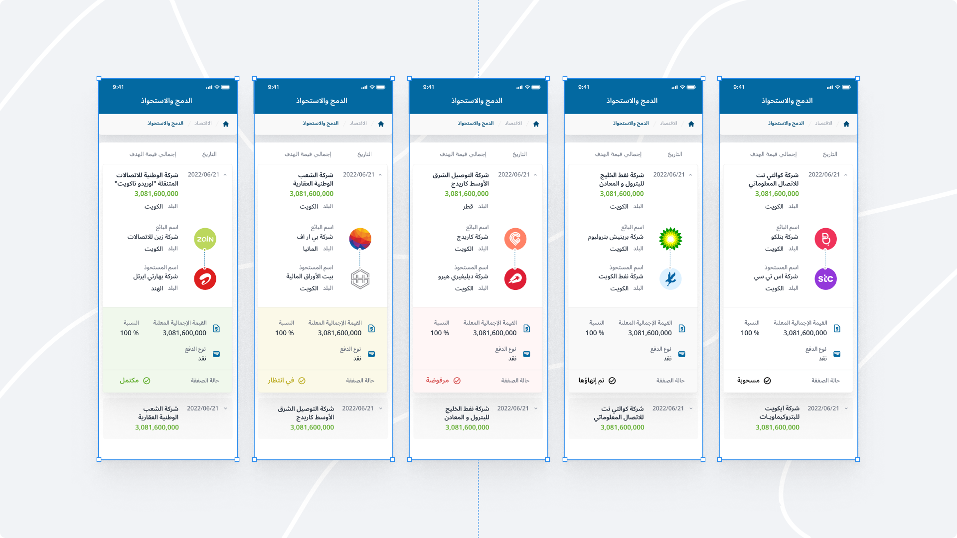
Using Visual Cues: Enhance the visual hierarchy and grouping by using visual cues such as color, shading, or borders. Apply these cues consistently throughout the UI to differentiate between different data groupings or container types also provide a visual summary and facilitate data comprehension at a glance.
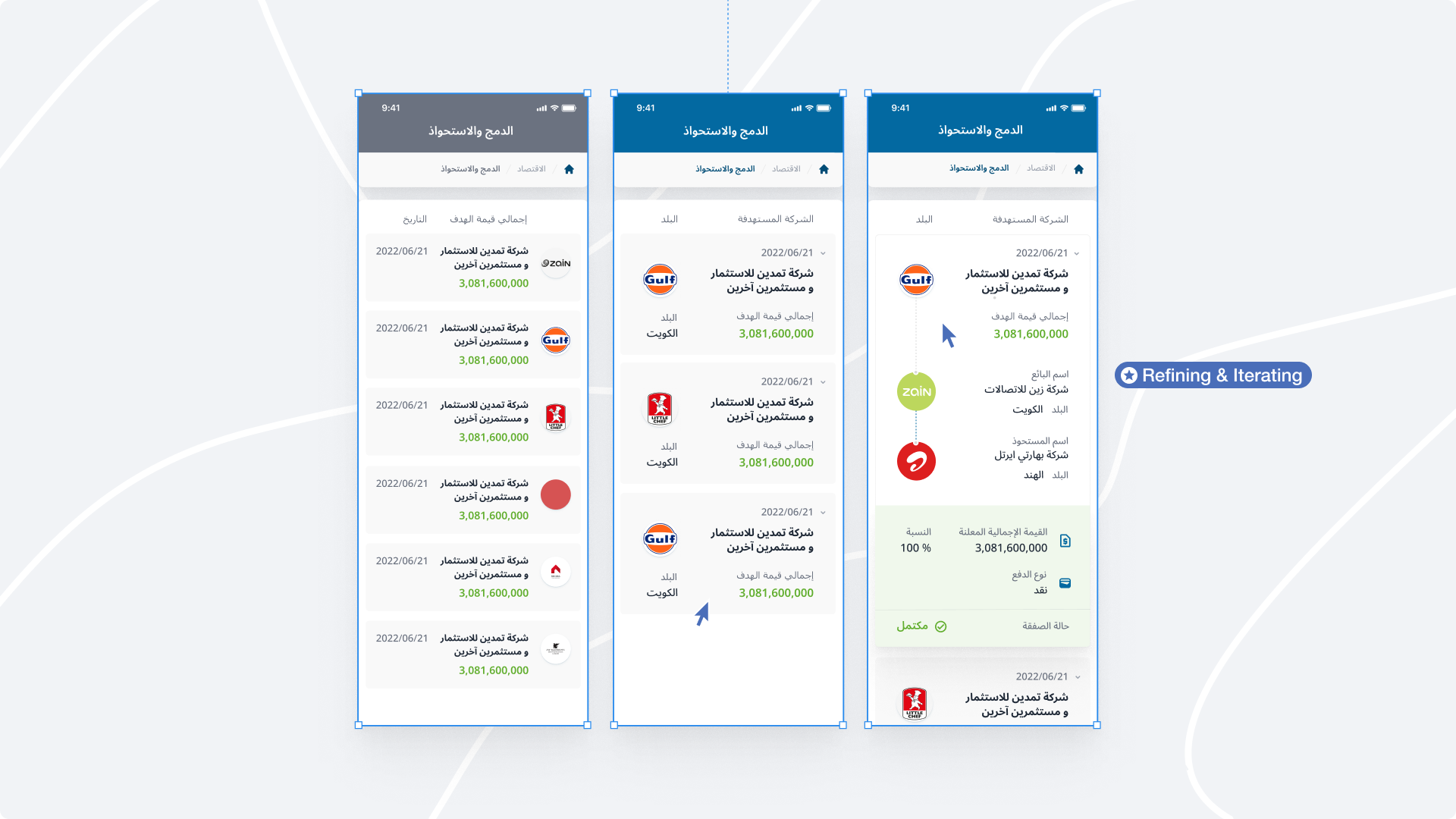
Refine and Iterate: Test the UI with users and iterate based on their feedback to ensure that the visual representation aligns with user expectations and the goals of the application.
Conclusion
Overall, where users are inundated with vast amounts of information, ensuring a well-structured and intuitive user interface is vital. Information Architecture acts as the backbone of UI design. While "Ted Lasso" may not directly address UI/UX design principles, these lessons can be derived from the show's themes and characters. Applying these principles can help UI/UX designers create more empathetic, user-friendly, enabling users to easily navigate, locate information, and interact with digital products.

For authoritative and reliable sources on information architecture and UI design, I recommend consulting the following books and resources:
- "Information Architecture: For the Web and Beyond" by Louis Rosenfeld.
- "Don't Make Me Think: A Common Sense Approach to Web Usability" by Steve Krug.
- "The Elements of User Experience: User-Centered Design for the Web and Beyond"
- "Information Architecture: Blueprints for the Web" by Christina Wodtke and Austin Govella.
- "Universal Principles of Design" by William Lidwell, Kritina Holden, and Jill Butler.
- "The Design of Everyday Things" ****by Don Norman.
- "Seductive Interaction Design: Creating Playful, Fun, and Effective User Experiences"
Additionally, you may find valuable insights from reputable websites and blogs such as NNGroup (www.nngroup.com), UX Collective (uxdesign.cc), Smashing Magazine (www.smashingmagazine.com), and UX Booth (www.uxbooth.com).