
Building web pages is a fast and easy process with modern web frameworks and libraries. However, the code structure might be a bit challenging and obscure for many developers. Atomic Design is a new way to structure your code! Today we will see how to use it and why you should consider it for your next projects!
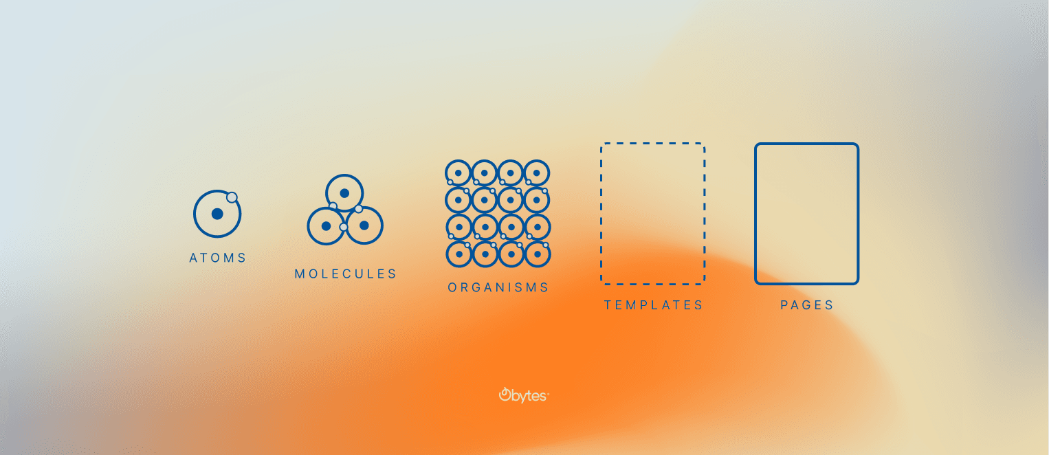
What is the atomic design approach?
Inspired by natural chemistry, Brad Frost introduced the Atomic design approach. the idea behind it is to decompose the layout into small components in order to make the code reusable.
We can define 5 different levels of components:
Atoms:
Which are the small core components, such as text, buttons, etc…
Molecules:
Contains a group of atoms to form a good and complete component, such as Headings with text, Text with an image, etc…
Organism:
A couple of molecules form a complete section like a hero or navigation.
Template:
A group of organisms well placed to form a full layout.
Pages:
A full web page is built using templates like a home page or a contact page.
Now that we have a clear introduction to the Atomic design approach, let’s jump into a real example! Fortunately, the website you’re currently reading, this blog from(Obytes), is built using Atomic design! Let me give you some real examples with code snippets.
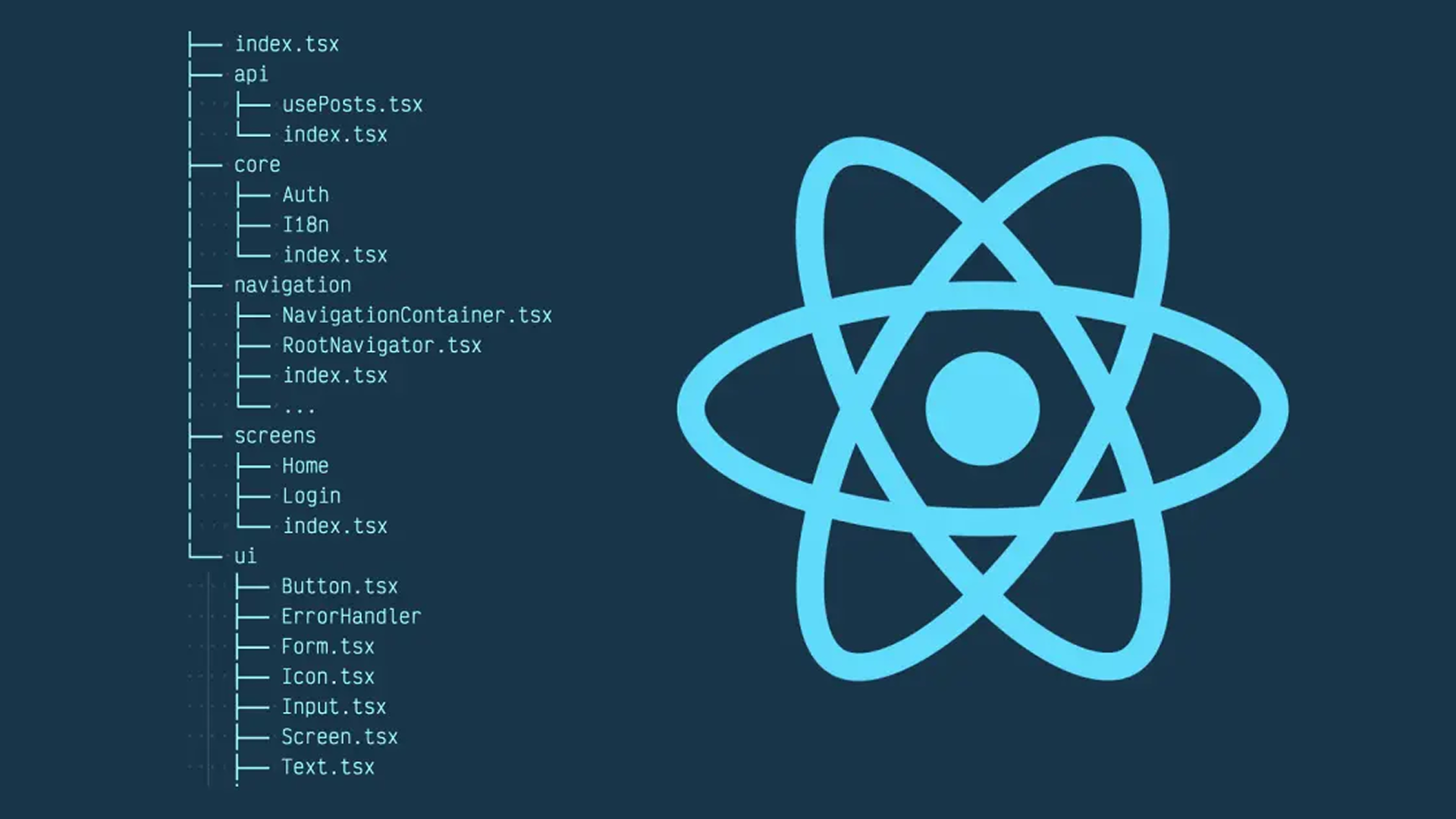
Folder structure
As you can notice the components folder contains the code folder for the atoms.
src
  |
  |_ Components
                |_ core
                |     |_	Button.tsx
                |     |_  Title.tsx
                |     |_  Input.tsx
                |
                |
                |_HeadingWith.tsx
Title Atom
For instance, the Title atom, is a simple h2 tag component with a title and style props to make it reusable.
import React from 'react';

export type TitleProps = {
  title: string,
  classNameTitle?: string,
};

function Title({ title, classNameTitle }: TitleProps) {
  return (
    <h2 className={` mb-3 mt-4 text-2xl lg:mb-5 lg:text-3xl	 ${classNameTitle}`}>
      {title}
    </h2>
  );
}

export default Title;
Button Atom
Button Atom is in a way more generic and reusable, with a variety of props such as icon, disabled, type …
import type { ReactNode } from 'react';
import React from 'react';

export type ButtonProps = {
  hasArrow?: boolean,
  bgColor?: string,
  label?: string,
  onClick?: () => void,
  type?: string,
  className?: string,
  color?: string,
  icon?: React.ReactNode,
  children?: ReactNode,
  Buttontype?: 'button' | 'submit' | 'reset' | undefined,
  disabled?: boolean,
};

function Button({
  icon,
  bgColor,
  label,
  type,
  className,
  color,
  onClick,
  children,
  Buttontype,
  disabled,
}: ButtonProps) {
  return (
    <button
      className={` cursor-pointer transition duration-200 hover:shadow-2xl disabled:cursor-not-allowed disabled:opacity-50 ${type}-btn ${className} ${bgColor} text-${color}`}
      aria-label={label}
      onClick={onClick}
      type={Buttontype}
      disabled={disabled}
    >
      {label}
      {icon}
      {children}
    </button>
  );
}

export default Button;
Heading with text molecule:
As an example of Molecules, HeadingWithText.tsx with title, paragraph, and button atoms.
import Link from 'next/link';
import React from 'react';

import type { ButtonProps } from '@/components/core/Button';
import CustomButton from '@/components/core/Button';
import type { ParagraphProps } from '@/components/core/Paragraph';
import Paragraph from '@/components/core/Paragraph';
import type { TitleProps } from '@/components/core/Title';
import Title from '@/components/core/Title';

type HeadingWithTextProps = Partial<ButtonProps> &
  ParagraphProps &
  TitleProps & {
    button?: boolean,
    /**
     * Button wrapped by anchor tag
     */
    link?: string,
    alignment?: boolean,
    width?: string,
    classNameTitle?: string,
    onClick?: () => void,
  };

function HeadingWithText({
  button = false,
  link,
  primaryTitle,
  title,
  paragraph,
  primaryParagraph,
  alignment,
  width,
  type = 'primary',
  label = 'labe',
  icon = null,
  className,
  color,
  bgColor,
  classNameTitle,
  onClick,
}: HeadingWithTextProps) {
  return (
    <div
      className={
        alignment
          ? `${width} flex  flex-col  items-center text-center ${className}`
          : `${width} flex  flex-col items-start ${className}`
      }
    >
      <Title {...{ title, primaryTitle, classNameTitle }} />
      <Paragraph {...{ primaryParagraph, paragraph }} />

      {button && (
        <CustomButton
          {...{ type, icon, label, className, color, bgColor, onClick }}
        />
      )}
      <Link href={link}>
        <a>
          <CustomButton
            {...{ type, icon, label, className, color, bgColor, onClick }}
          />
        </a>
      </Link>
    </div>
  );
}

export default HeadingWithText;
To conclude, Atomic design might seem over-engineered however developers really appreciate it for a lot of reasons, to mention a few:
- It provides high-end performance and increases productivity.
- Changes and updates can be made in no time due to the structure!
At Obytes we adopt the atomic design approach. Delivering high-performance products to our clients is a top priority!
Don’t forget to get in touch, We're excited to hear from you!